


A dashboard shows you more, but seeing more isn’t understanding more. When the thinking behind your marketing is clear, most metrics turn into background noise and only a few matter. When it’s unclear, every number feels urgent. Dashboards don’t cause that confusion; they expose whether the thinking underneath was ever there.
There’s a quiet assumption behind most dashboards: that if you can see more, you can understand more. It rarely holds. What a dashboard really does is compress activity into visibility, and then that visibility gets mistaken for clarity.
But clarity isn’t a function of how much you see. It’s a function of whether what you see connects to a coherent line of thinking.
The Real Problem Is Not Data, It’s Disconnection
A dashboard is a surface. It shows impressions, clicks, conversions, cost per result, open rates, and funnel drop-offs. Each metric is accurate in isolation, and isolation is exactly the problem.
When metrics aren’t anchored to a clear center, they behave like fragments. Each one suggests a direction. Put together, they produce noise, the same way a stream of good-sounding content can leave no impression: individual pieces each make sense, but without a stable center they never accumulate into meaning.
A dashboard doesn’t manufacture that fragmentation. It makes an existing one visible.
Dashboards Don’t Create Thinking, They Expose It
There’s a deeper inversion here. Most people believe dashboards help them make better decisions. What dashboards really do is expose the quality of the decisions already being made.
When the underlying thinking is unclear, every fluctuation feels significant, every metric feels actionable, and every change feels necessary.
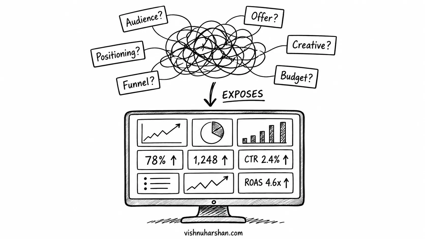
When the thinking is clear, most metrics fade into background noise, only a few signals actually matter, and decisions become slower but steadier.
Where thinking is borrowed rather than owned, interpretation turns reactive. A dashboard won’t fix that. It magnifies it. This is the deeper pattern behind so much of what shows up on the screen: marketing problems tend to begin in the thinking, long before they reach a metric.
When Every Metric Starts Asking for Action
You open your ads dashboard. Cost per lead is slightly higher than yesterday. Click-through rate is down. Impressions are stable. Nothing is clearly broken, but nothing feels stable either.
So you start adjusting. You change the creative because CTR dropped. You tweak the audience because costs rose. You touch the budget because performance feels uncertain.
Each decision makes sense on its own. None of them comes from a clear point of view. They come from the discomfort of not knowing what to trust.
By the end, the system hasn’t improved. It’s only been disturbed.
The Illusion of Control
Dashboards offer a subtle psychological reward: the feeling of control. You can refresh, track, and compare, and it all feels like progress.
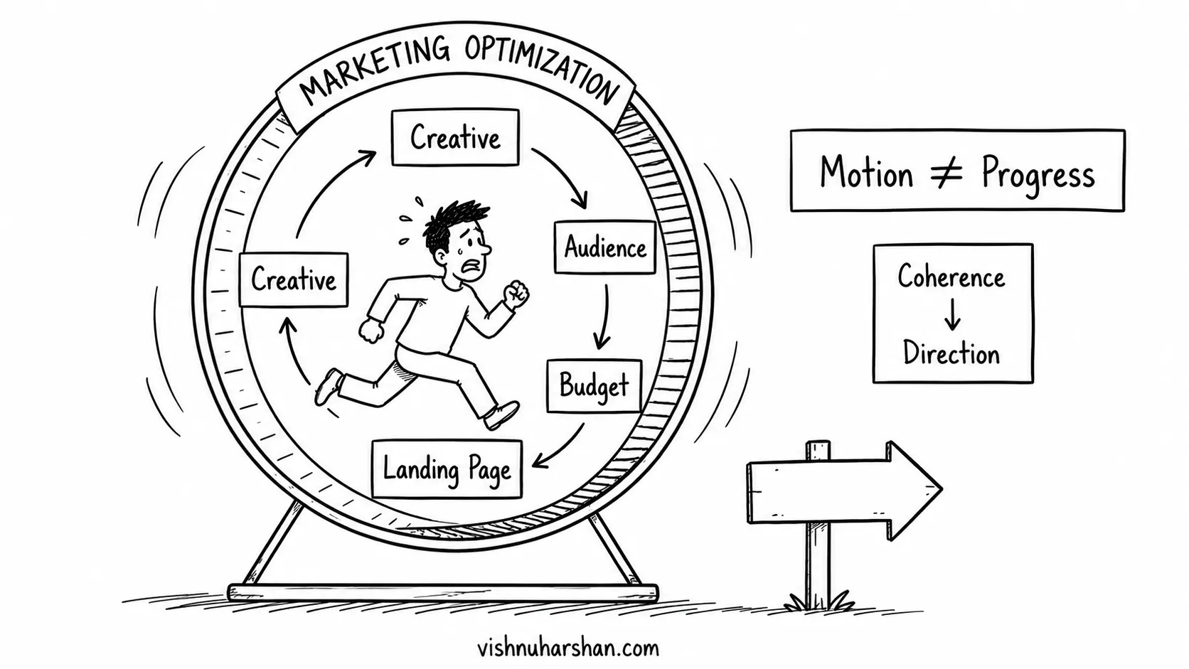
But control without coherence leads to drift. When you react to metrics without a stable lens, you optimize campaigns without understanding positioning, adjust targeting without clarity on the audience, and tweak funnels without knowing what they’re meant to reveal. Over time the system grows more complex and less aligned.
When Everything Looks Important
Your dashboard shows several signals at once. Conversion rate has dropped. Cost per click is steady. Engagement is slightly up. Each metric points to a different interpretation.
So you start addressing all of them. You adjust the landing page, test new creatives, reconsider your targeting. Not because you’ve identified the core issue, but because the dashboard laid out several possibilities without telling you which one actually matters.
Trying to respond to everything, you lose the ability to prioritize anything.
When the Dashboard Says It’s Working, But It Isn’t
A shamanic retreat brand was generating leads at a very low cost. On the surface everything looked right. The ads were performing and the numbers were strong. But very few people were actually signing up.
Nothing in the dashboard pointed to a problem. If anything, it suggested the opposite.
The ads had been built on borrowed hook structures. They attracted attention easily, created curiosity, and lowered the barrier to entry, so people signed up to see what this was about, rather than because they’d recognized themselves in the experience being offered.
Inside the funnel, the articulation wasn’t clear enough to bridge that gap. The transformation wasn’t fully understood and the audience wasn’t fully aligned, so interest stayed at the surface.
From the dashboard’s perspective, this looked like efficiency. From a thinking perspective, it was misalignment. The system was optimized to generate leads, not to attract the right kind of decision.
Funnels, Dashboards, and the Same Misunderstanding
Dashboards and funnels share a misunderstanding: both get treated as tools that create growth. But these systems don’t generate clarity. They reveal whether it’s present. Funnels do the same thing dashboards do, surfacing the state of your thinking rather than changing it.
When the underlying thinking is unclear, high impressions don’t matter, low conversion rates are inevitable, and engagement stays inconsistent. The dashboard will show all of this. What it won’t do is explain it, because the explanation lives upstream.
Why More Metrics Usually Makes It Worse
When confusion appears, the instinct is to add more visibility: more breakdowns, more attribution layers, more comparison windows. This compounds the issue because the shortage was never data. It was hierarchy.
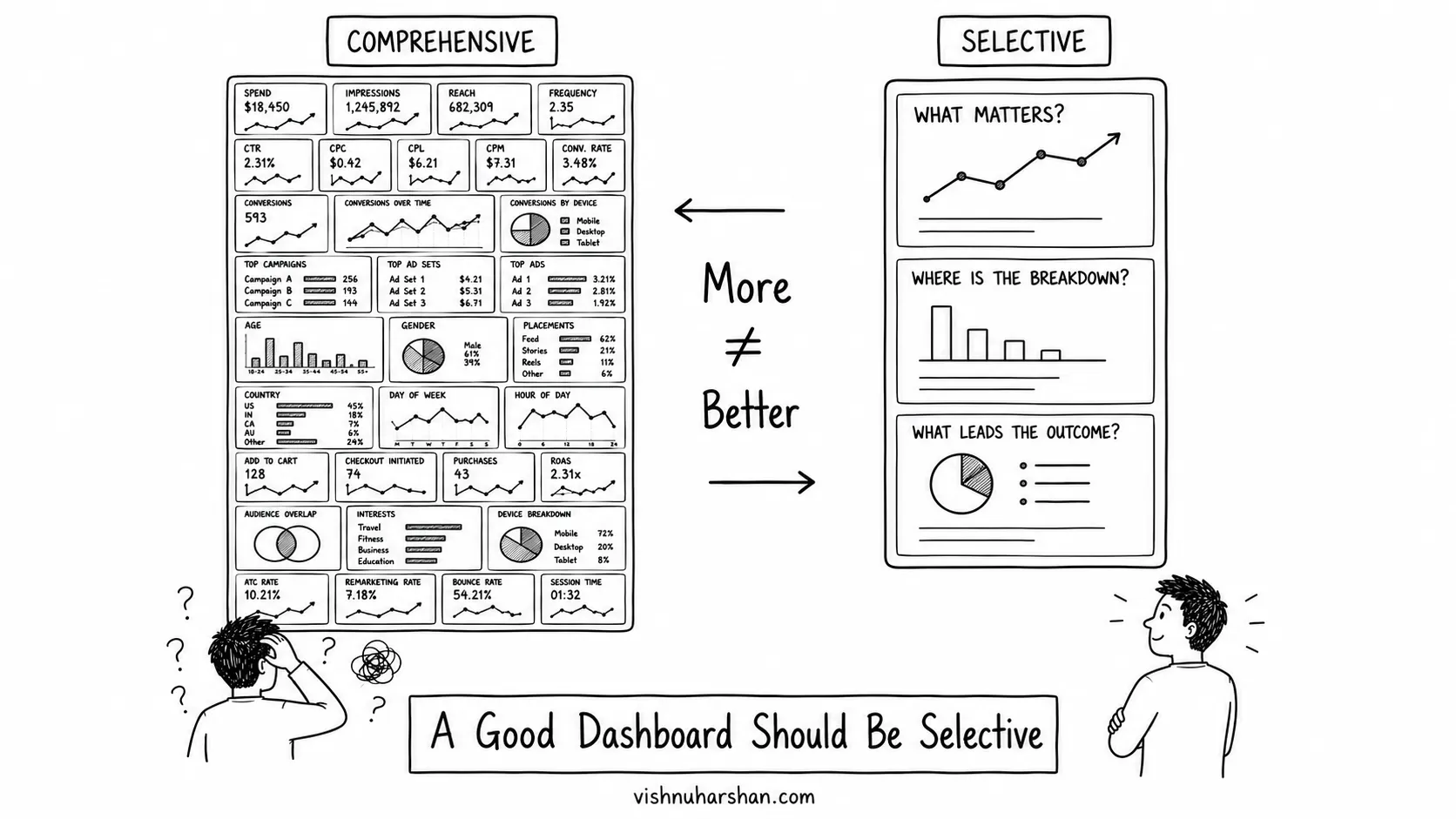
Without a hierarchy, everything looks equally important, nothing guides decision-making, and attention keeps shifting. This is why so many systems feel fully tracked and still stay unclear.
Clarity Is a Filtering Mechanism
Clarity doesn’t come from dashboards. It determines how dashboards get used. When thinking is aligned, you already know what matters before you open the dashboard; you look for confirmation rather than direction, and you ignore most of what’s on the screen.
This reflects a deeper principle explored in Alignment + Articulation = Growth. Growth compounds when thinking organizes attention, not when tools expand it. A clear system reduces what you look at. An unclear one expands it endlessly.
The Emotional Layer Most People Miss
Dashboards create subtle emotional loops. Small dips feel like failure. Small spikes feel like validation. Neutral data feels like stagnation.
All of it drives constant intervention, and constant intervention erodes coherence, not because the individual actions are wrong, but because they aren’t grounded in a stable perspective.
What a Clear Relationship With a Dashboard Looks Like
A useful dashboard isn’t comprehensive. It’s selective, built around a few anchored questions: What signal actually reflects alignment? Where does breakdown happen when clarity is missing? Which metric is a leading indicator rather than just a report?
Getting there isn’t about adding or removing widgets. It’s about deciding, before you look, what each number is allowed to change. Four moves make that concrete:
- Start with the decision, not the metric. For every number on your dashboard, ask what you would actually do differently if it moved. If the honest answer is nothing, it doesn’t belong on your main view. Keep the handful of metrics tied to a real decision and move the rest out of sight.
- Name the one question the dashboard exists to answer. Most founders are really tracking a single thing: whether the thinking is still holding up in the market. Write that question down, then keep only the metrics that speak to it directly. Cost per lead matters when your question is about acquisition efficiency. It’s just noise when your question is about whether the right people are converting.
- Set the threshold before you open it. Decide in advance how much a metric has to move before it means anything. A 4% dip in click-through on a Tuesday is normal variation, and naming the threshold ahead of time stops you from reacting to it. This is where most dashboard-driven thrashing comes from.
- Give leading signals the prominent spot. Revenue and total conversions tell you what already happened. Message-to-click alignment or the quality of inbound questions tell you whether the thinking is landing before the results catch up. Put those higher, because they are the ones you can still act on.
Used this way, the dashboard becomes a checkpoint rather than a decision engine. It confirms whether your system is aligned instead of telling you what to do next.
This Is Not a Dashboard Problem
What you’ve seen here isn’t really about dashboards. It’s what happens when measurement tries to compensate for unclear thinking.
To understand it properly, you have to see the system behind it:
→ Marketing in Practice: How Clear Thinking Turns Into Systems That Generate Growth
Where the confusion begins
Why more tracking doesn’t fix it
What actually creates clarity
How systems should work instead
- The Hidden System Behind Consistent Lead Flow
- Marketing in Practice: How Clear Thinking Turns Into Systems That Generate Growth
Where breakdown becomes visible
Closing Thought
Dashboards don’t create confusion. They reveal the absence of structure behind decisions. When thinking is unclear, every metric feels important. When it’s clear, most of them recede. That’s why adding more data rarely helps: it expands attention without organizing it. Clarity does the reverse, reducing what matters before you even look.
Once that’s in place, a dashboard stops feeling like a source of insight and becomes a mirror of whether your system is aligned.
